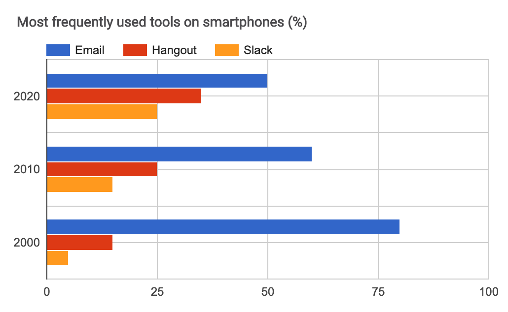
Displays data in horizontal bars using exact numbers. This chart requires two columns in the datasheet.
Datasheet:
Column 1: String (text) or Number
Column 2: Number
Columns 3, 4, 5, etc. (optional): Number
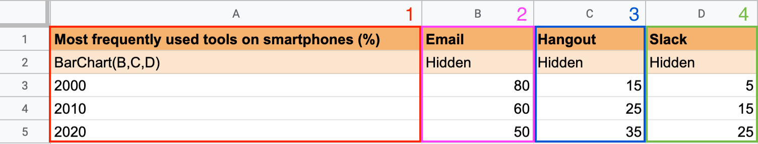
Column 1 contains the Y-axis values: in the second row, add the keyword BarChart and the columns you want to display; in this example: BarChart(B,C,D).
Column 2 contains the values of Bar 1: add the values you want Awesome Table to display on your chart.
Columns 3, 4, 5, etc. (optional) contain the values of Bars 2, 3, 4, etc. You can add a third column, or more, in your spreadsheet to display several series of data on your chart.
You can use this keyword in the Charts app.
Learn more about Bar Chart.