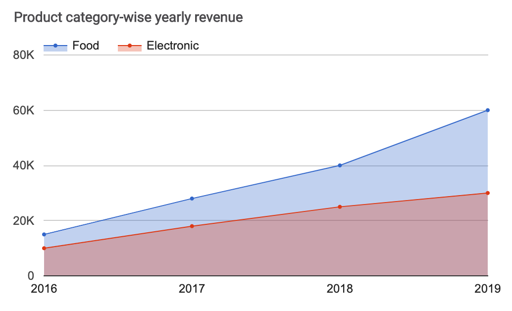
Displays quantitative data from one or more series with lines and colored areas. The areas overlap, enabling easy comparison between series. This chart requires two columns in the datasheet.
Datasheet:
Column 1: String (text), Number or Date
Column 2: Number
Columns 3, 4, 5, etc. (optional): Number
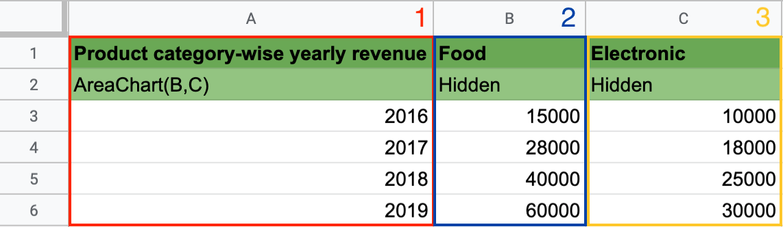
Column 1 contains the X-axis values: in the second row, add the keyword AreaChart and the columns you want to display; in this example: AreaChart(B,C).
Column 2 contains the values of Line 1: add the values you want Awesome Table to display on your chart.
Columns 3, 4, 5, etc. (optional) contain the values of Lines 2, 3, 4, etc. You can add a third column, or more, in your spreadsheet to display several series of data on your chart.
You can use this keyword in the Charts app.
Learn more about AreaChart.