Creates a personalised mix of several charts. Use a marker type if you want to put forward information on your chart. Each series can be assigned a different marker type: area chart, stepped area chart, line chart or column chart.
This chart requires two columns in the datasheet.
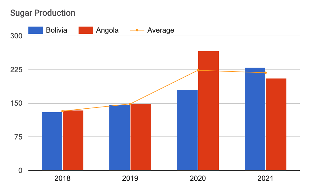
In our example, we used a line chart to display average sugar production:
Datasheet:
Column 1: String (text) or Number
Column 2: Number
Columns 3, 4, 5, etc. (optional): Number
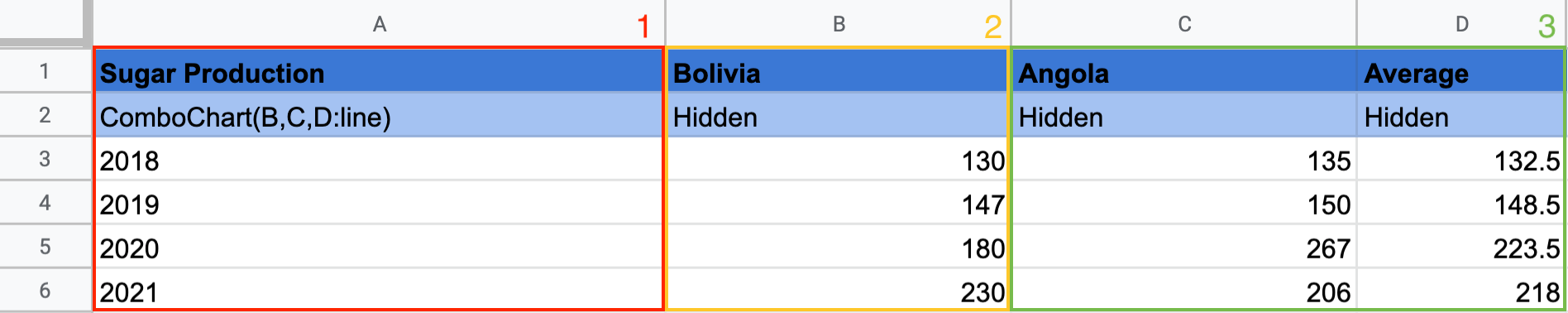
Column 1 contains the X-axis values: in the second row, add the keyword ComboChart and the data column you want to display; in this example: ComboChart(B,C,D:line).
If you want to display an average line, add :line in the keyword cell, as shown above.
Column 2 contains the values of Line 1: add the values you want Awesome Table to display on your chart.
Columns 3, 4, 5, etc. (optional) contain the values of Lines 2, 3, 4, etc. You can add a third column, or more, in your spreadsheet to display several series of data on your chart.
ComboChart uses marker types. Each series can be assigned to a different marker type.
| Type of chart: | Marker type: |
| - area chart: | :area |
| - stepped area chart: | :steppedArea |
| - line chart: | :line |
| - column chart | :bars |
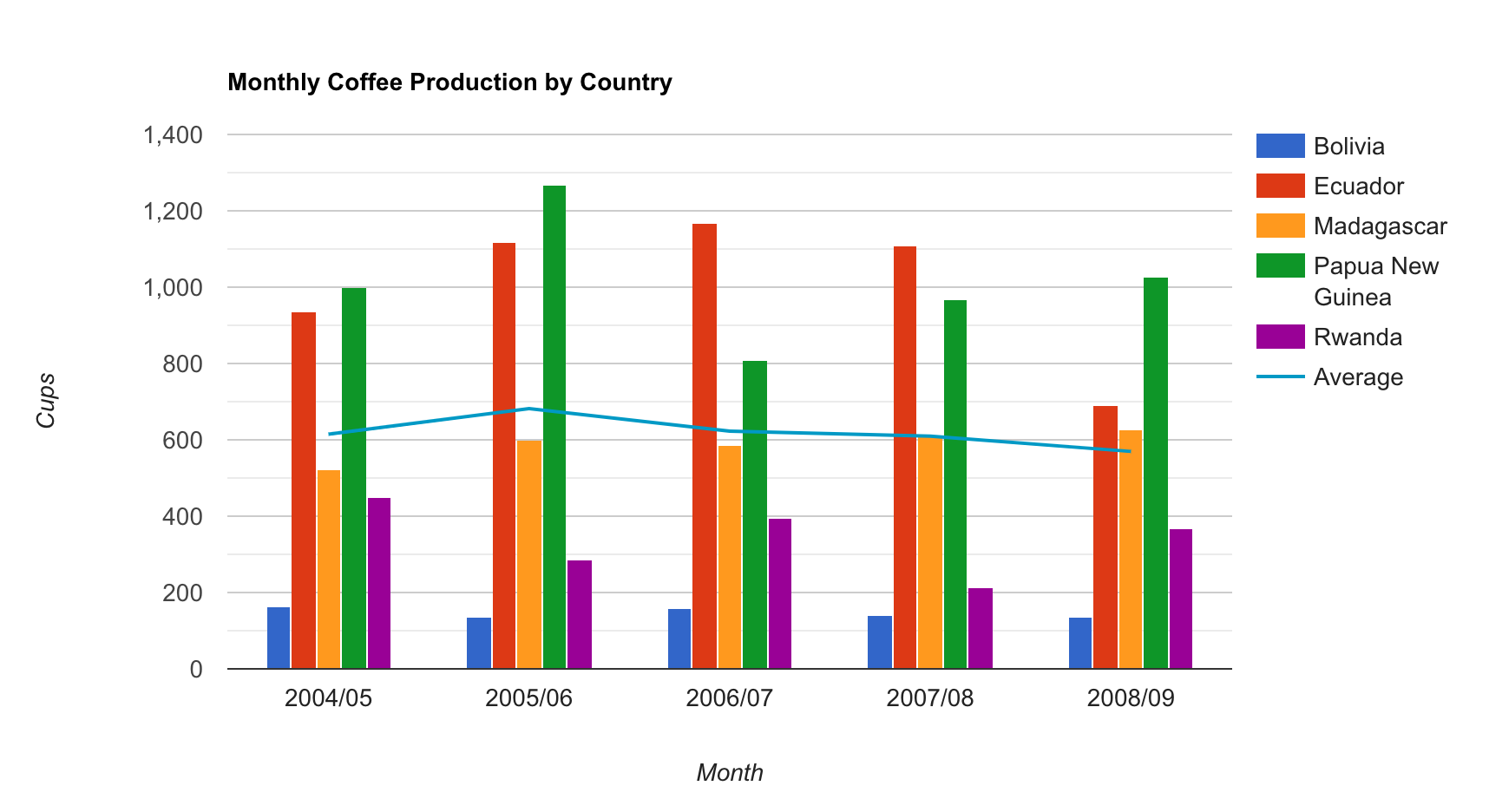
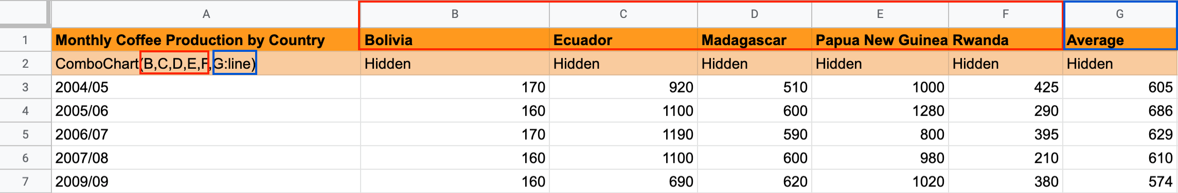
In this example, the column G has been assigned as the average line: ComboChart(B,C,D,E,F,G:line)
You can use this keyword in the Charts app.
Learn more about Data Format.
Learn more about ComboChart.